Branding & Collateral
LOGO DESIGN
Cayuga Technologies delivers customized cloud and AI-driven data management solutions for businesses in all types of industries.
The company was named after Cayuga Lake – one of the Finger Lakes in Western New York state. We echoed the unusual shape of the lake in the graphic part of the logo while still keeping a clean and sharp design.
Established in 1916, The Dayton Woman’s Club is a nonprofit organization devoted to empowering women and strengthening the community.
Their previous logo was decades old and did not align with their current and future initiatives. We chose a contemporary yet timeless typeface and paired it with a sophisticated purple – the color of the women’s suffrage movement – to pay homage to all of the historical women who fought tirelessly for equal rights.
The Hall Hunger Initiative is a Dayton-Ohio-based nonprofit that works with community partners to build a just and sustainable food system. In addition to supporting local farmers and local food actions, the group aims to educate people about the benefits of local food.
We created the slogan “Eat Fresh, Buy Local” for their summer local food awareness campaign on social media, local news outlets, and billboards. The logo we designed is vibrant, easy to read, and works well in many sizes.
New Life Forestry of Ohio is a small, family-owned hardwood lumber company that specializes in custom live-edge wood furniture and wholesale wood slabs for homes, retail, and corporate environments.
They requested a logo that would showcase their natural aesthetic and emphasize their goal of preserving lumber for generations to come. We used a natural color palette with a clean typeface and encircled it with a rough edge reminiscent of tree bark.
Sports Card Huddle is the ultimate online destination for sports card collectors. Hobbyists from all over the country can connect with each other, share ideas, learn about upcoming events, and easily locate any sports memorabilia store in the U.S.
The logo needed to reflect the idea of enthusiasts being excited to connect and share their excitement for the hobby. We chose a modern typeface that echoes the block format commonly used in sports as a base for the fans cheering inside a stadium.
Scien Tech Group (STG) advises and implements technology solutions for US-based and international clients who need to modernize their IT infrastructure.
Their original logo was out-of-date and just used the letters STG as a monogram. We updated the lettering with a clean, sans-serif typeface and created a stylized graphic to represent both technological advancement and global connectedness.
COLLATERAL MATERIAL EXAMPLES
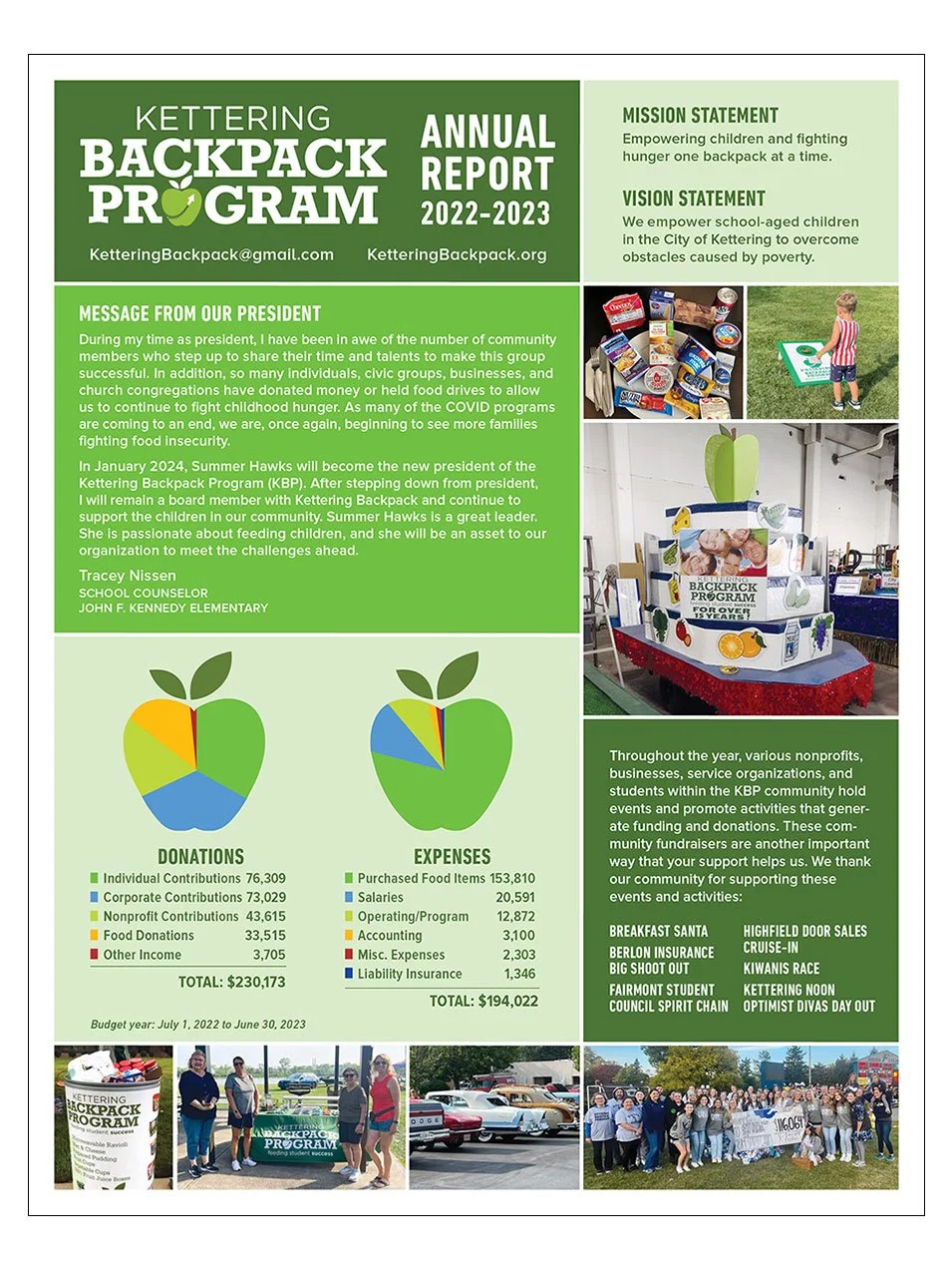
Kettering Backpack Program | Annual Report
The Dayton Woman's Club | Business Cards (2-sided)
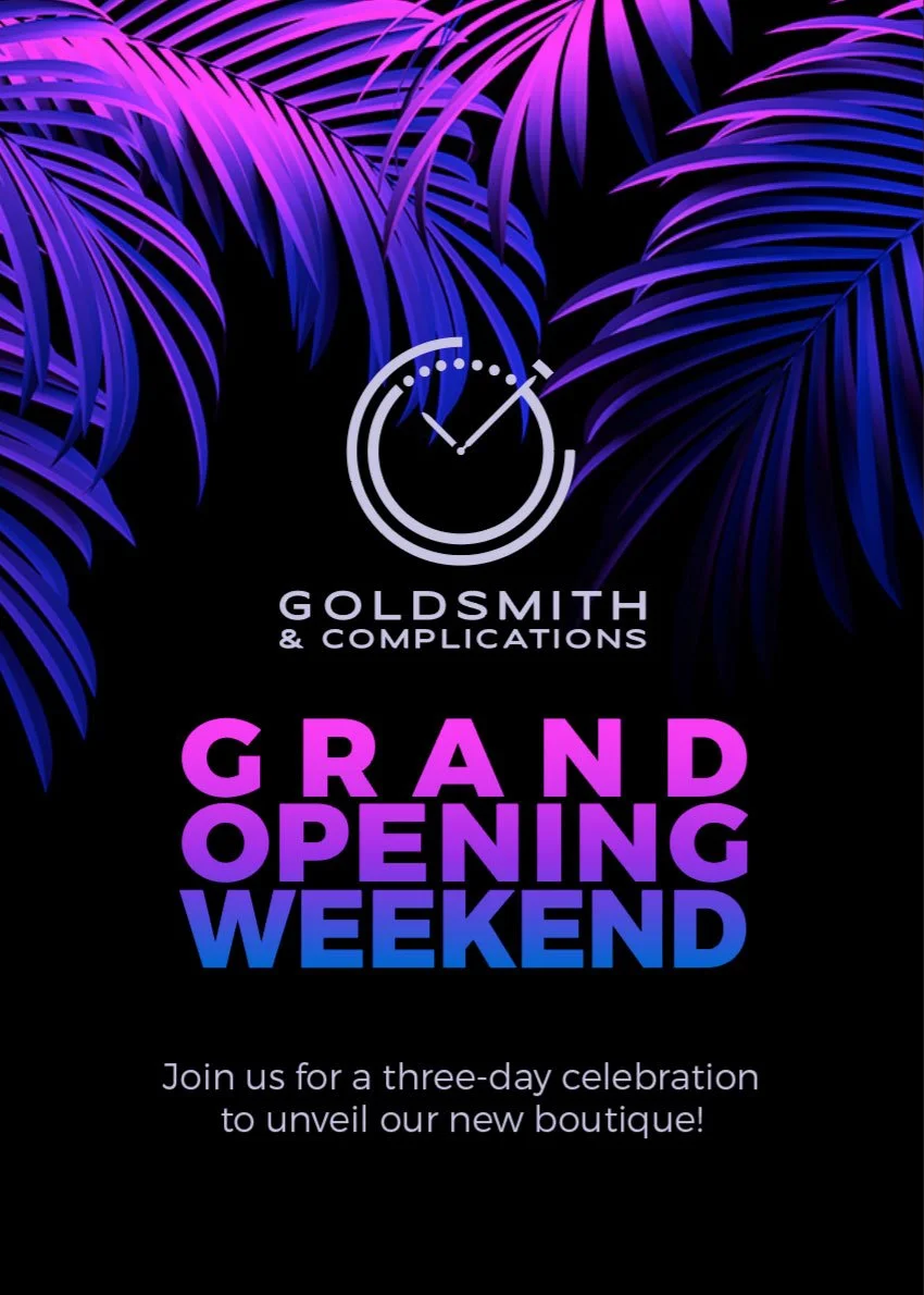
Goldsmith & Complications | Grand Opening Invitation
New Life Forestry of Ohio | Business Cards
S3 Business Solutions | 80" Banner
Meridian180 | Double Gatefold Brochure
Goldsmith & Complications | Business Cards (2-sided)
Hometown Video Transfers | 66" banner
The Dayton Woman's Club | Flyer
Goldsmith & Complications | 60" Banner


